The Gajim team has been hard at work in the past months to prepare the next v1.4 release. The upcoming version brings a major interface redesign. In this post, we explain how the new interface works and what remains to be decided or implemented before the release.
Of course, your feedback is important ! No interface can please everyone, so please react to this post with how this change would impact you positively and negatively, and ideas you have to make it even better before the release.
This blog post is in part based on the Gajim 1.4 UI/UX Preview given by lovetox, a current maintainer of Gajim. So if you prefer the video format, click on that Youtube link or use your favorite Invidious instance to view it with a lightweight, privacy-friendly client. That presentation was given as part of the XMPP Office Hours programme, where you can find other interesting presentations about the Jabber/XMPP ecosystem, or propose your own!
Single-window application
The main change in Gajim’s new release is that, in the current implementation, it becomes a single-window application. We’ve been used for over a decade to have separate windows for the contact list ( roster ) and for chats. This user interface pattern was common with early 2000’s messengers such as MSN and ICQ .
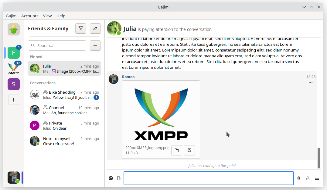
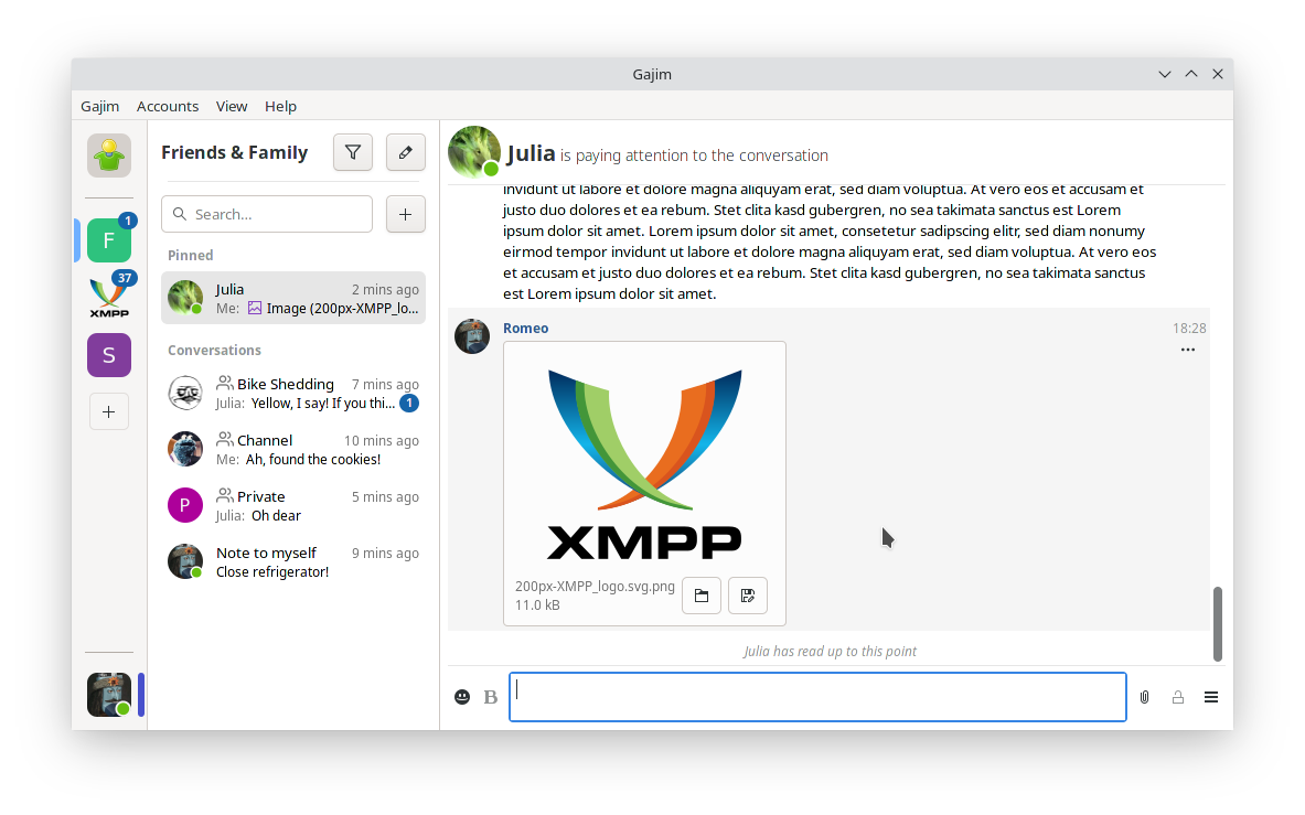
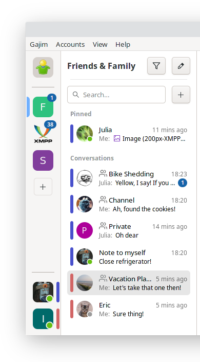
In the upcoming release, we make Gajim a single-window application, where all features are always within your reach. This change is inspired by more recent messengers such as Element , Discord or Mattermost (among others). This is what it looks like so far:
Some people feel left out by this new feature and the removal of the multi-window mode, however we hope to reconcile our users’ needs as part of the Gajim project, as explained in the Areas for improvement section of this blog post.
Workspaces
Gajim v1.4 will introduce a new concept: workspaces . Previously, all tabs were considered equal as a flat list within a window. We understand the need to organize some activities into a specific context, but without multiple windows, we organize these activities by workspace.
A workspace is a collection of group chats and private chats, organized client-side. For the moment, this is a non-standard, Gajim-specific feature, but standardization efforts are explained in the Areas for improvement section.
We introduced a new sidebar on the left of the window which allows to navigate your workspaces and accounts. After clicking any workspace, the chat list will be displayed in the sidebar. This chat list, to the right of the workspace list , provides navigation for chats (both group chats and private chats) within the current workspace. The currently focused workspace has a colored bar indicating it’s the current context.
Below the workspace list, the sidebar lists your accounts. Clicking an account will display a page containing the contact list , your avatar, a status selector, and a list of pending notifications. Contacts in the contact list are organized by roster groups, as was already the case in previous versions.
Account context
Each account is attributed a specific color, in addition to its avatar. This color is reused in the chat list , alongside the tab’s avatar so you can see instantly which account of yours is used in a specific chat. When a given chat/account doesn’t have an avatar defined, one is generated from the first character of its displayed name.
Gajim with multiple accounts
When a notification is received within a certain workspace, an indicator with the number of unread messages will be shown on the workspace icon and on the chat.
Organizing your interface
Workspaces can be reordered manually within the sidebar by drag-and-drop. However, these two different types of context are kept separate: the workspaces appear on top of the list, while accounts are listed on the bottom. When there’s too many entries to display, the workspace/chat list becomes scrollable.
Chats can also be moved from one workspace to another, though not via drag and drop: simply right-click a chat and from there the “Move to” menu will move the selected chat to the requested workspace. However, it isn’t possible currently to copy a chat to another workspace; moving an entry to a new workspace will remove it from its previous workspace.
Within a given workspace, chats can be pinned . These stay in place at the top of the workspace’s chat list . Chats which are not pinned are ordered by latest activity. This way you never have to scroll endlessly to find the chat that matters to you. For the moment, pinned tabs cannot be reordered like workspaces, but we plan to implement it.
Try it out and let us know
There’s a lot of upcoming major changes in the next Gajim v1.4 release, so stay tuned to the blog for further information. In the meantime, you can test the new interface by running Gajim from sources using just a few commands. This feature is not published in nightly releases yet because it’s still unstable, so do not use it as a daily-driver yet.
Important: Note that you have to start Gajim with a test profile using gajim -s -p testprofile or launch.py -s -p testprofile in order to preserve your current profile. Migrating back is not possible.
git clone https://dev.gajim.org/gajim/gajim && cd gajim to download Gajim’s source into a gajim folder and moving there git checkout mainwindow to browse the development branch with the new UI pip install . to install Gajim’s development version and all dependencies to your python environment, then gajim -s -p testprofile to start - alternatively,
./launch.py -s -p testprofile to start Gajim without installing it, in which case dependencies should be manually setup first (for example On Ubuntu )
Feedback is welcome in any form, whether on our issue tracker , in our community chat gajim@conference.gajim.org , or as a blog post on your own website. The main tracking issue for this new user interface is #10628 .
Areas for improvement
In this section, we explain the shortcomings of the current implementation of the workspaces feature, and what could be done to improve it. We are actively looking for ideas on these areas, so if you can afford it, please spend some time to gather your thoughts and help us improve Gajim.
Accessibility
Account context relies on user-supplied colors. However, for accessibility concerns (color-blindness), we would be interested to support other graphical patterns instead of colors. For example, dots and dashes and other visual patterns that are common in graphs and tables. However, unless we get more contributions, it’s unlikely this feature will be released in v1.4.
Internationalization
The main window redesign does not support right-to-left (RTL) languages in a special way yet. The navigation sidebar will be displayed on the left-side of the screen in all cases.
UI customization
Some users have already expressed their anxiousness at the idea of dropping support for multiple windows in Gajim. However, there is technically no barrier preventing us from reimplementing is with our new User Interface. It’s “just” a lot of hard work.
For example, maybe we could have a mode where each account gets its own window that could move around separately? Or focus a space from the main window into its own window? That would be useful when using virtual desktops (sometimes called workspaces, what a coincidence) in your favorite desktop environment.
In addition, we could explore to support multiple sidebars on multiple axis, so that you could decide where to place your accounts list , and divide your workspace list into a top and bottom sidebar.
Only your imagination and contributions to the Gajim project are the limit for the kind of experience we can provide, but it’s very unlikely deeper UI customization will be implemented in time for the v1.4 release. We are a volunteer-run project and cannot afford to spend time to accommodate every single need there is, although contributions are always welcome.
More workspace organization
Currently, pinned tabs in the chat list cannot be reordered in the way that workspaces can be in the workspace list . Would this be useful for you?
Moreover, Gajim’s new workspaces UI currently features a 2-level representation like Mattermost, where any chat only has a single ancestor workspace. The account roster is an exception, because it features a 3rd-level nesting in order to fit roster groups, where each entry is part of a group, which is part of the account workspace context. Maybe workspaces could benefit from this approach in order to represent 3-level hierarchies akin Discord/Element interface.
Also, a chat can currently only be featured in a single workspace, for the sake of simplicity. That’s a fine assumption as long as workspaces are managed by a single user for their needs, but would not play well with sharing workspaces with other users, in which case a chat may appear more than once in the workspace tree.
Standardization and interoperability
As mentioned briefly, we’re considering how our new workspaces feature can be represented server side, so that it can be used by other clients, and maybe even shared across users.
Sharing a workspace with several users, similar to Matrix “spaces” or Discord “servers” could prove very useful for online communities administering a bunch of channels, for example to set space-wide permissions. It could also enable to subscribe to a public workspace maintained by a contact of yours, featuring a bunch of 3rd party group chats on a specific topic.
While there is not yet a specification for such hierarchical organization of chats in the XMPP ecosystem, there was an XMPP Online Sprint last winter studying Discord’s user experience in order to benefit the Jabber/XMPP ecosystem.
More recently, some people have started to gather thoughts that should lead to a specification. There is a work-in-progress document (a pad ) which anyone can edit with feedback, and a spaces@joinjabber.org group chat has been setup to discuss this issue in a cross-project manner. Your ideas and contributions are more than welcome, even if you’re not familiar with the Jabber/XMPP ecosystem. Feedback on how a new specification could be made interoperable with other decentralized networks is very welcome.

chevron_right


